
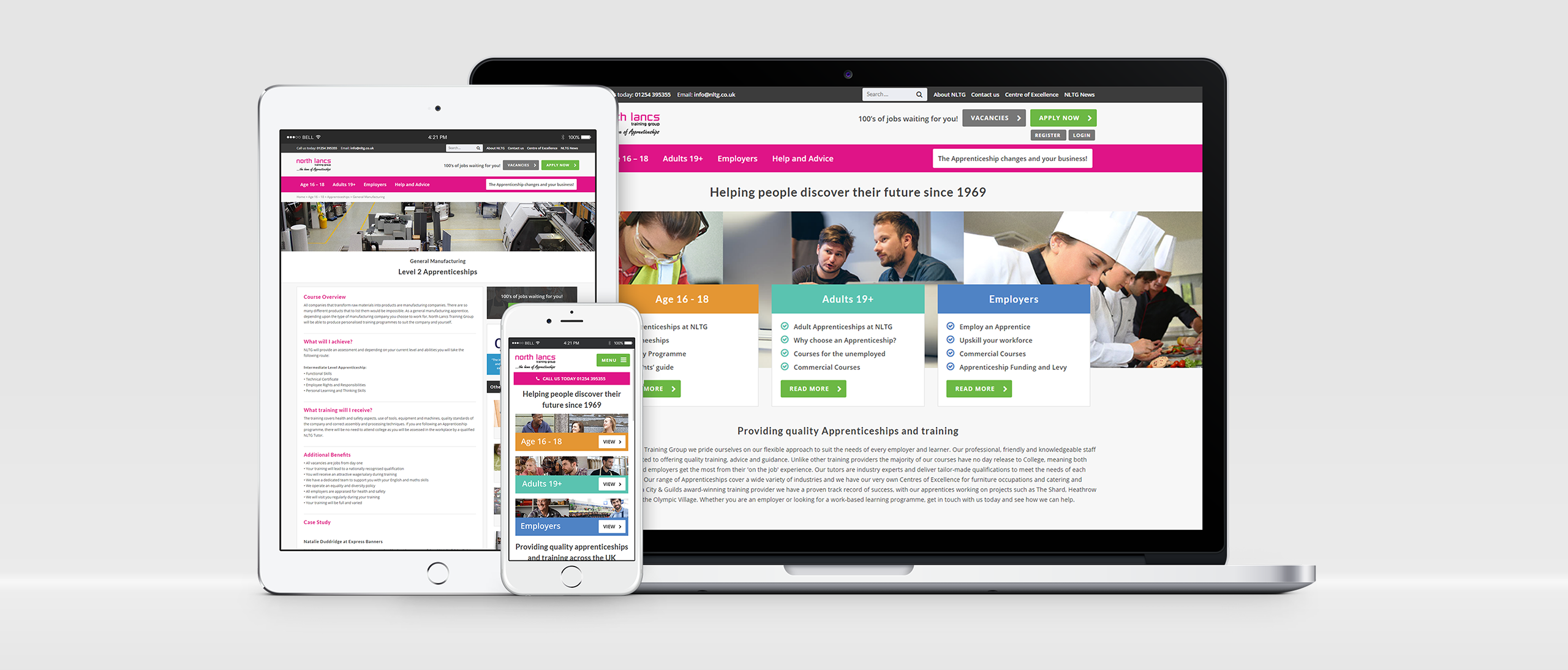
The Overview
North Lancs Traning Group are an established company based in Accrington, Lancashire. They are one of the largest training providers in the country delivering quality Apprenticeships in a variety of sectors. We were commissioned to create a modern, fresh design as their current website design was becoming quickly outdated. They also needed the website to be easy to use, with a clear flow for each type of user to find the information they need, and direct customers to the end goals. The project was a large in-depth process starting with industry research, bespoke sitemap and navigation, wireframes, page-by-page design proofs, development and ongoing SEO and CRO services.
The Process
The design and build of a website is only the beginning of a process that requires a complete bespoke roadmap, in order to achieve a market leading website. We divide the project into stages to allow us to focus our efforts efficiantly.

Before we begin....
Competitor and Industry Research
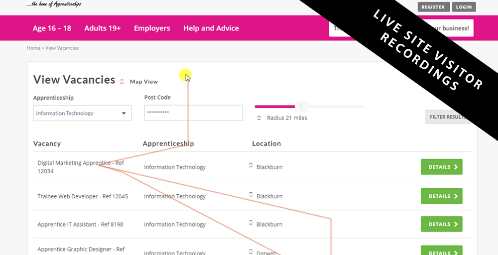
The main competition for North lancs Traning Group were other traning providers in the local area, including all the local colleges. We collated 'user profiles' to get an insight into what each type of person is looking for when visiting the website. The users included candidates looking for an Apprenticeship, employers looking to take on an Apprentice or train their current staff, aswell as teachers and parents of students leaving school. We noticed that there was a niche that many competititos were lacking, which was to have an integrated jobs board, allowing the employers to signup and list their own vacancies, aswell as improving the process of candidates subscribing. NLTG did have a vacancy section, but the process was hard to find and not very user-friendly.


Then onto the visuals....
Designing for user experience
Desktop & Tablet
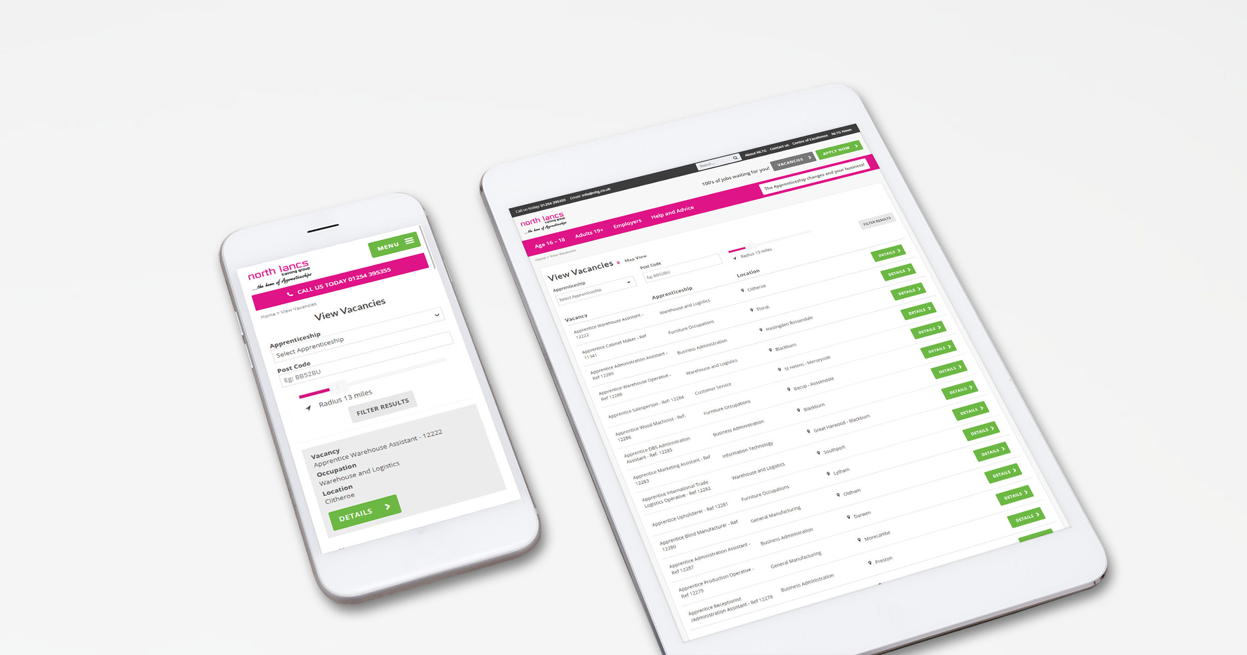
Desktop and tablet users are able to view the full desktop experience, as research tells us users prefer this over the mobile experience when using a tablet.
Mobile UX
For mobile users, we made sute they still had the full details of the vacancies, but altered the layout to display them in a format that was easier to read on a small screen.
Next we developed the website...
Market Leading Features
Jobs Board
As the main focus of the business is to provide traning for Apprentices, we built a customised Jobs Board allowing candidates to view and apply for positions, and employers to list their vanacies.
Mega Menu
It was important for users to quickly access areas of the website such as courses and advice pages. We create a large mega menu allowing the use to drill down to third-level categories, improving the usibility on site.
Accessibility
Due to the nature of the company, it was fundamental that we code the website using design standards set to make the website accessable for those with disabilities.
Downloadable Resources
Many guidlines of the company follow along side with new laws set by the goverment, so the need to update information guides was essential. We created an easy upload and download feature both admin and front end.
CV Builder
To save admin time contacting applicants and manually entering their information, we created a CV builder on site in the signup process, which then sends the information to the approriate areas.
Job Application Management System
The admin section had to be customised to work with their internal systems already in place. Staff at NLTg can now manage vacancies, applications, interviuews, employers and candidate profiles.
Quick Contact Form Popout
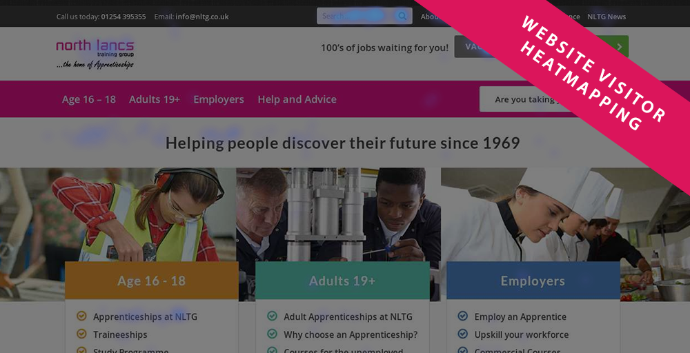
Some companies use a live chat feature but this is very draining on resources. By having a sticky 'have a question' on the website this has increased their goal conversion rate for collecting valuable data.
SEO Opitmised Blog
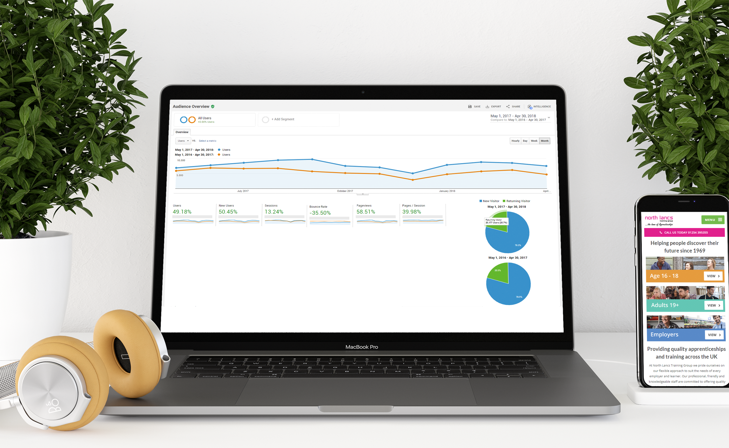
By creating a blog feature, we add fresh, new content every month to the website. By improving their SEO we have seen a huge increase in organic traffic in the last 12 months.
Our work didn't stop there...
Marketing, Monitoring and Optimisation
Get ahead, and stay ahead...
We constantly monitor the performance of the website
Lorem ipsum dolor sit amet, consectetur adipiscing elit. Nunc ut enim mauris. In hac habitasse platea dictumst. Duis at nibh at ligula volutpat tincidunt. Ut commodo quis ex ac auctor. Nullam interdum egestas ligula, eget commodo lorem gravida eget. Aenean nibh turpis, tempus vel pretium nec, pulvinar id nisi. Sed risus ipsum, scelerisque ac velit vel, vestibulum commodo quam. Sed pellentesque id arcu nec congue.
The Results
The actual design and build of a website is only the beginning of a process that requires a complete bespoke roadmap, in order to achieve a market leading website. We divide the project into two stages to allow us to focus our efforts efficiantly. Below we explain what is involed in each phase and why every part plays an important part in the end result.
Based on a 12 month period from March 2017-2018 compared to the previous year 2016/2017
Rise in organic traffic
Increase in revenue
Increase in conversion rate
Targetted keyword improvements
Top ranking keywords
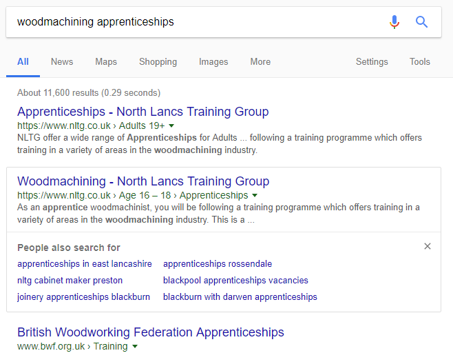
By creating targetted landing pages and our ongoing SEO work we have seen an increase in the appearence in the top positions on page 1. Below are more keywords that have moved to the top...
- #1Keyword here
- #2Keyword here
- #3Keyword here
- #4Keyword here
Services Provided
Website Re-design
Bespoke Web Development
Conversion Rate Optimisation
Search Engine Optimisation
Some of the technologies we use...


